Acrisure Thumb.jpg

Women in Small Business Month


Women in Small Bussines Month


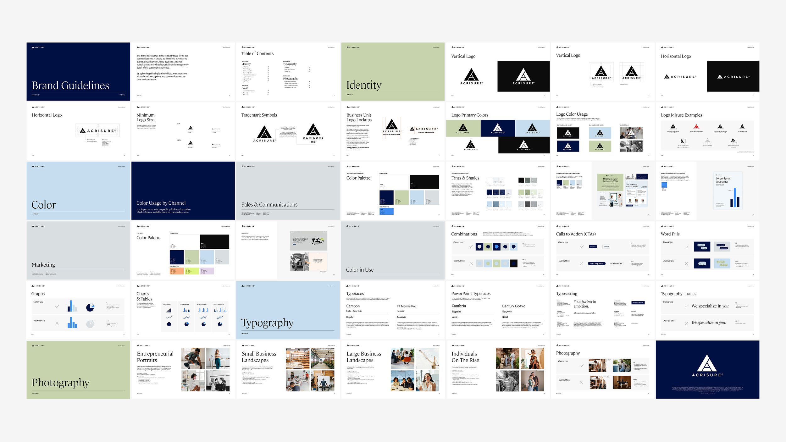
With a newly refreshed brand identity, Acrisure needed clear guidelines and scalable design systems to ensure consistency as the brand evolved.

I led the creation of the brand guidelines and identity system, partnering with marketing and cross-functional teams to update creative, including the website, digital campaigns, presentations, and reusable templates, to support adoption across the organization.


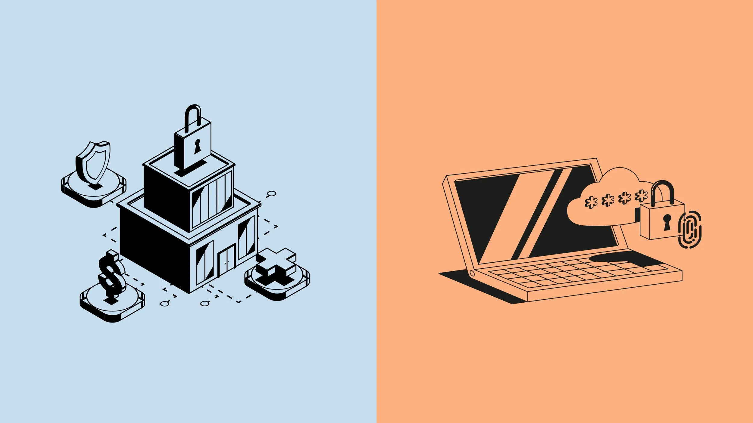
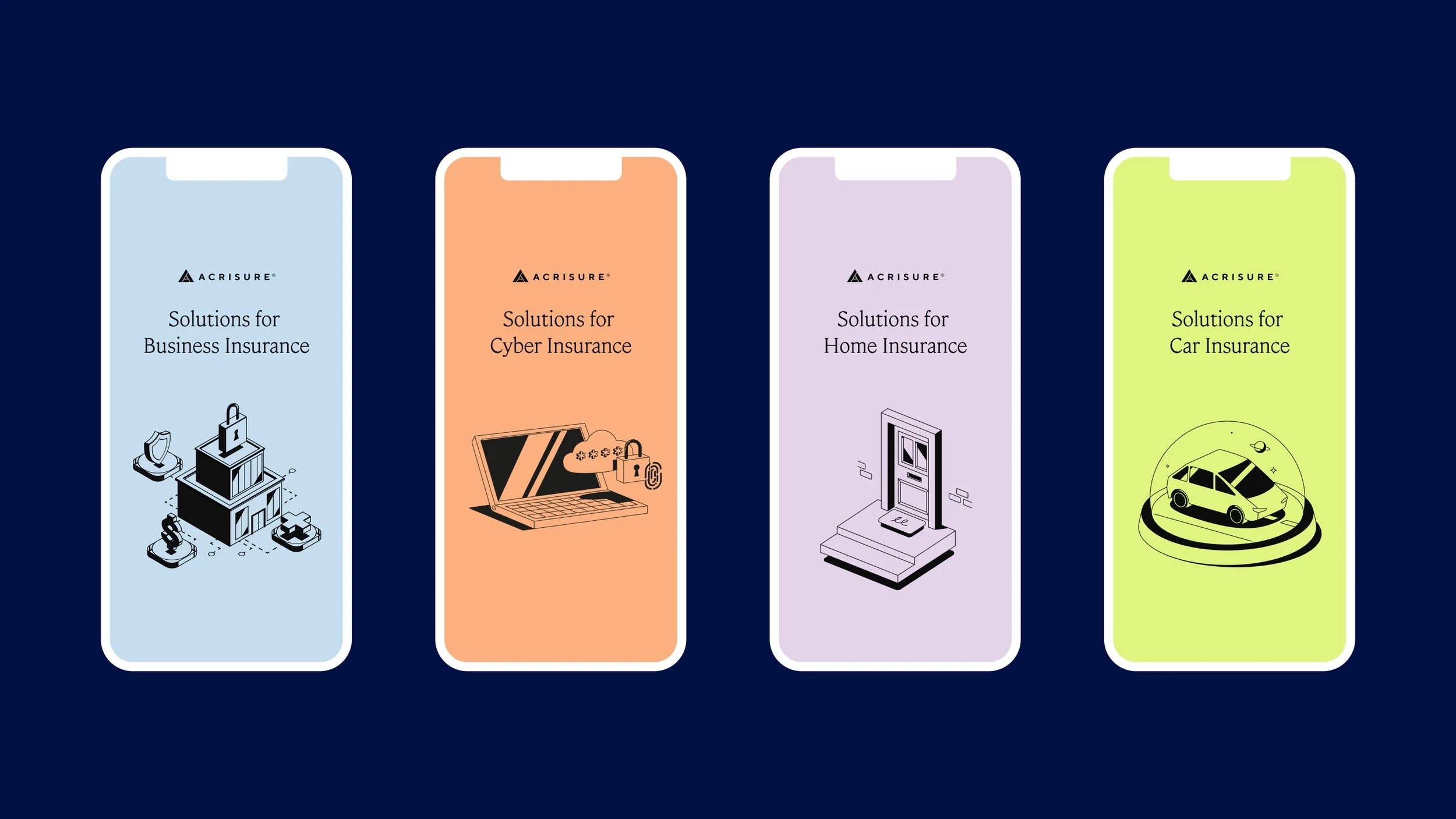
One of the key challenges was creating a color system that could support two distinct audiences without feeling like two separate brands. Acrisure serves both business and personal insurance customers, who have very different expectations and emotional touchpoints.

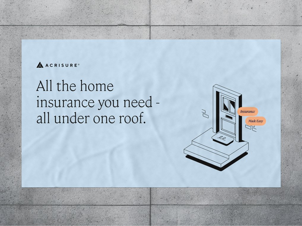
I led the development of a color strategy that created clear distinction while maintaining a unified brand. For business-facing communications, we leaned into a more restrained palette to convey trust, professionalism, and stability. For personal insurance, we introduced bolder colors to create a warmer, more approachable, and consumer-friendly feel.


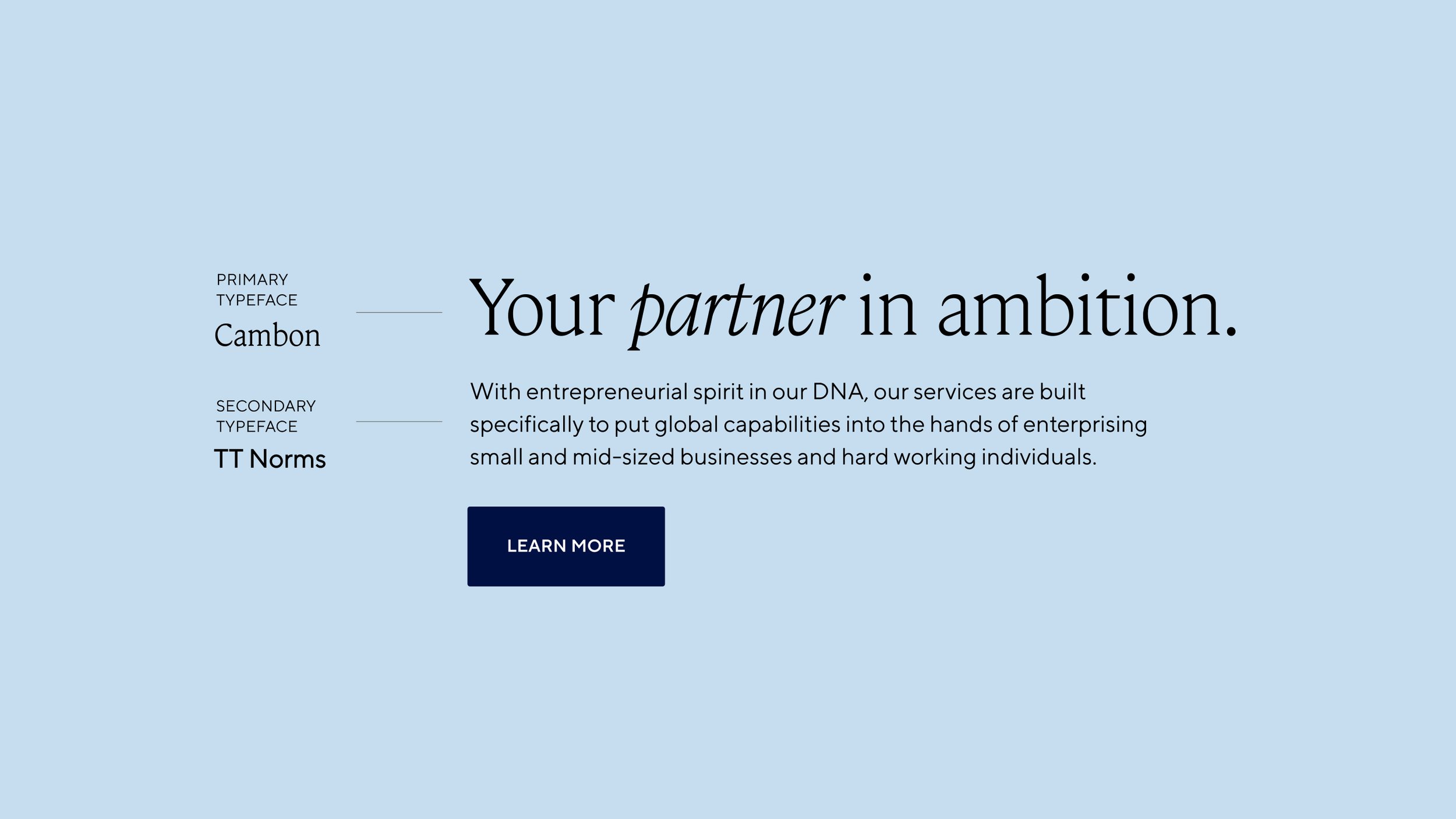
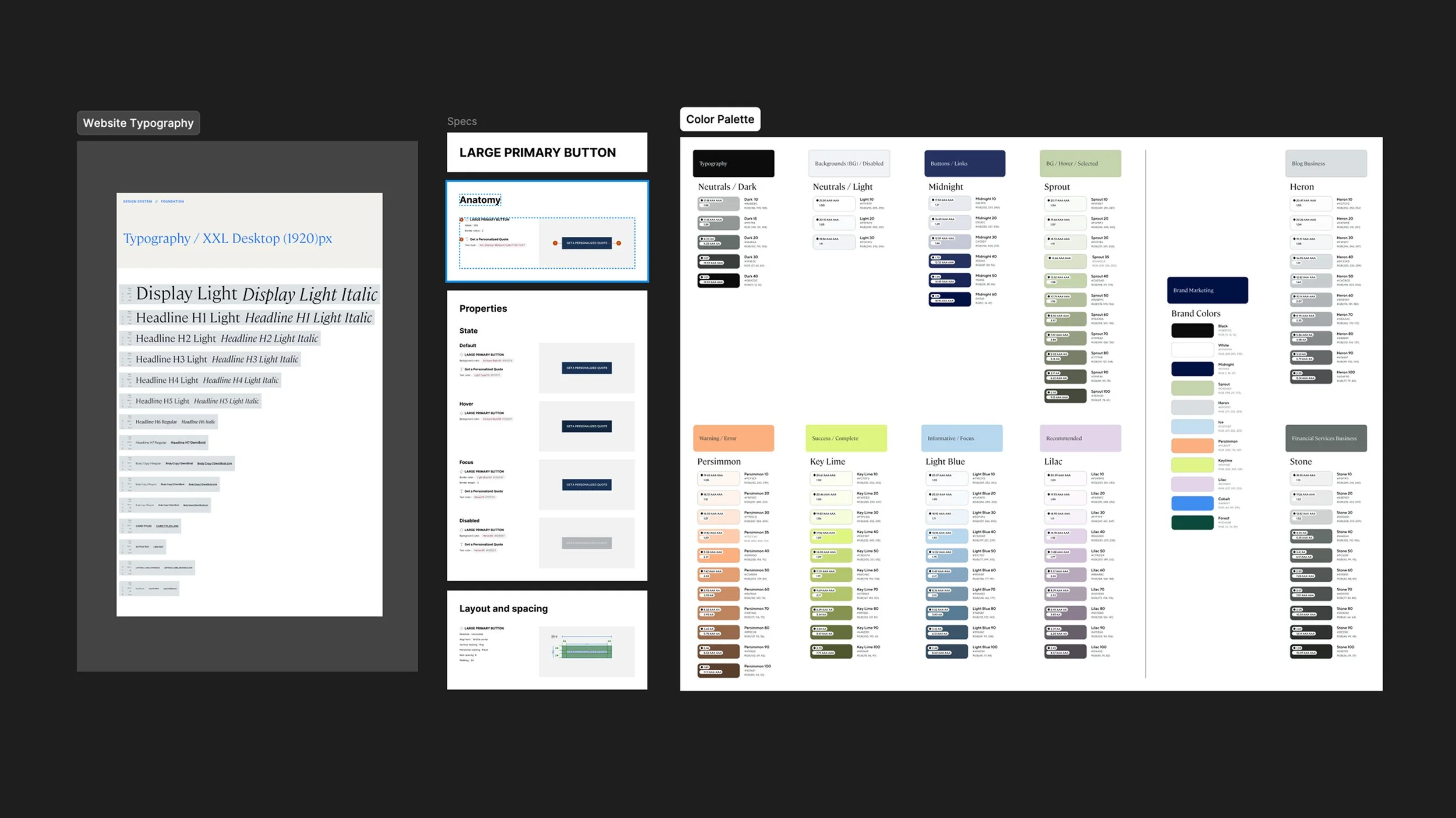
I collaborated with Product and Engineering to implement the brand system across the website, ensuring typography, color, and other core visual elements were applied consistently and were technically feasible.


The result was a centralized brand system that became the foundation for future creative work. It significantly improved consistency across campaigns and gave teams a much clearer framework for creating new assets.